Basic Approach to Pie Chart
What is Pie Chart?
Pie chart is a specific type of data representation wherein the data is represented in the form of a pie, i.e. a circle.
The circle is divided into various segments, each one of them representing the percentage share or proportional share of the entity in question as compared to the total.
Thus, a pie chart uses pie slices to show the relative sizes of various categories. In fact, the main purpose of the pie chart is to show part-whole relationships.
However, the nature of the parts should be such that they are mutually exclusive, i.e. there should not be any overlap between them.
Now let us understand what we mean by the term ‘total’. Just as in terms of percentages the total percentage is 100% and in terms of ratios the total is represented by 1, in a circle/pie the total is equivalent to
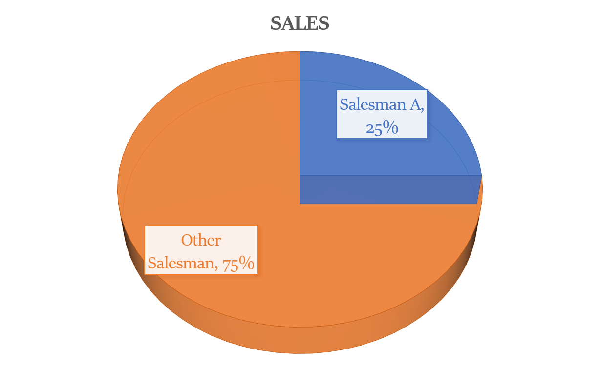
For example, if sales by a salesman A is 25% of the total, i.e. 1/4th of the total, then it means that the slice representing his contribution (as compared to the total sales) in the pie-chart will have an angle of
Thus, we now know that a pie chart is used to show the break-up of one continuous variable into its constituent parts.
We also know that, pie charts show percentages (it holds true even when the numbers on the chart are not expressed in percentages) and that the percentage share of the various slices always add up to 100% of the whole.
They are a cognitively less complicated manner of representing data related to a single variable and hence are pretty handy for the cause of drawing comparisons, i.e. they are an easy visual way to show the relative share of items in the final value of the variable in question.
For example, the pie chart given below shows the percentage share of four car companies, Ford, Mercedes, Jaguar and Hyundai, in the sales of the cars, in the first quarter of the year 2021.
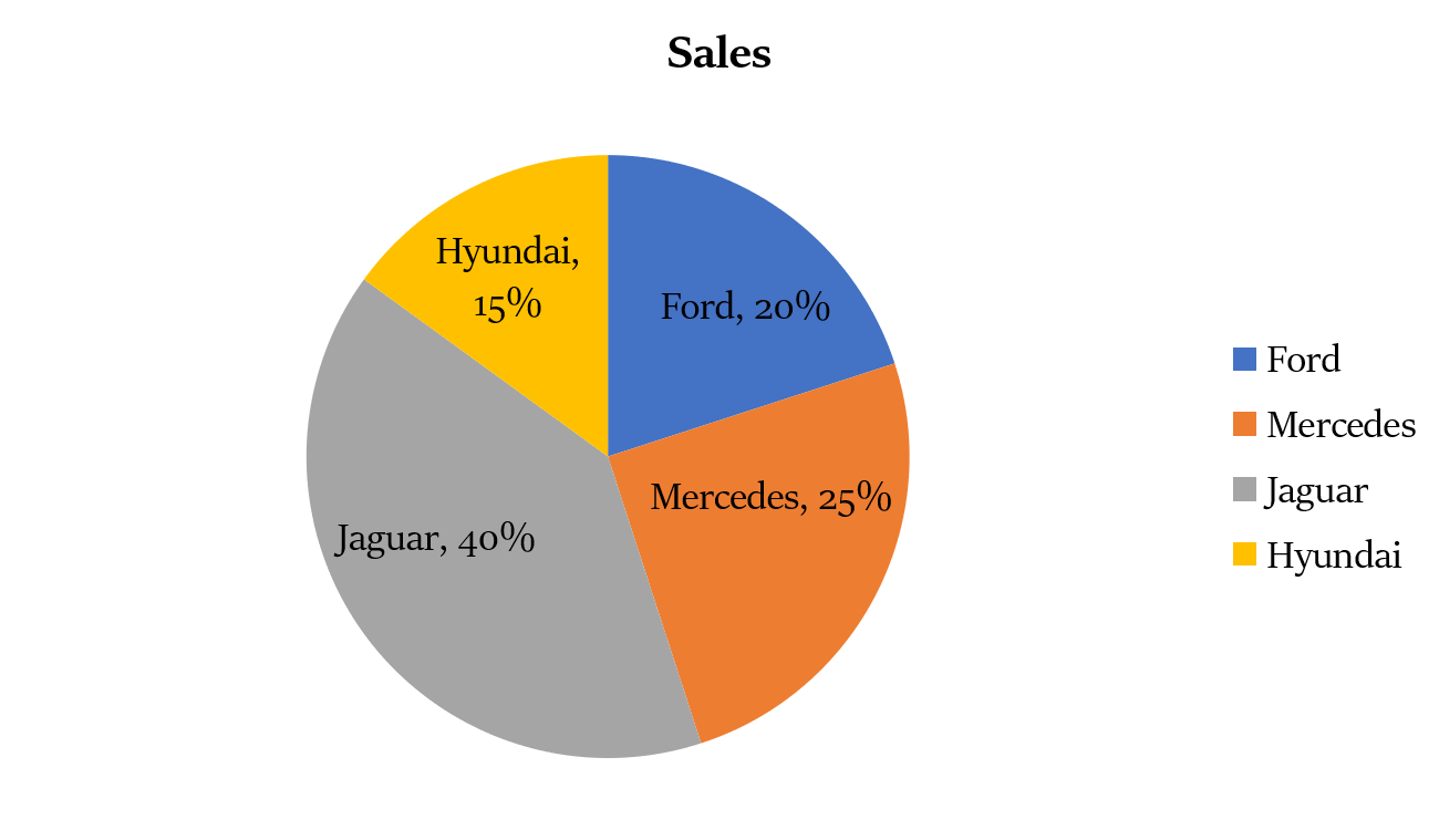
Looking at the chart above, we can infer that Jaguar accounts for 40% of the market share, while Ford, Mercedes and Hyundai account for 20%, 25% and 15% of the market share.
A single pie chart can represent only one continuous variable, e.g. sales of cars in the graph given above. Hence, in terms of versatility of data representation, pie charts are less versatile than bar charts, line charts or tables.
However, their utility lies in the fact that the representation of data is cleaner and it gives a clear idea of the relative distribution of the continuous variable amongst its different constituents.
Generally, the total value of the variable represented in the pie chart is given, e.g. the total car sales in the first quarter of 2021 are 20 lakhs. In order to efficiently tackle the DI questions framed on pie charts, one needs to have a good command over the basic concepts of percentages, ratios and the art of comparison making.
Types of Pie-Chart Questions
Broadly, the questions that are framed on a pie chart may be of two types:
Type 1
Questions demanding one to find out the absolute value, e.g. find out number of cars sold by Ford. We may drive the absolute value of the sales of the cars by individual companies by making use of the percentage shares represented in the pie chart.
For example, Number of cars sold by Ford in 2021 = 20% of the total cars sold in 2021 = 20% of 20 lakhs = 4 lakhs
Type 2
Questions demanding one to make comparisons, e.g. which company sold the second highest number of cars in the year 2021?
In such questions one may not be required to find the absolute values and thus may save an ample amount of time and effort in unnecessary calculation. An aspirant needs to develop a knack of realizing such scenarios.
For example, we can infer from the pie chart that Jaguar, Ford, Mercedes and Hyundai account for 40%, 20%, 25% and 15% of the market share, the total number of cars sold being 100%. Thus, the second highest number of cars was sold by Mercedes.
Similarly, we may find the ratio of the number of cars sold by any two companies, say Ford and Hyundai. Again, we need not calculate the number of cars sold by them, as we already know that Ford and Hyundai sold 20% and 15% of the cars respectively. Thus, the required ratio is 20:15, i.e. 4:3.
Keep in mind that we are being able to do so because the base of the percentages in both the cases is the same, i.e. the total number of cars sold in the market in the year 2021. It’s so because a single pie chart can represent only one continuous variable.
Multiple Pie-Charts
The DI sets may also be based on more than one pie chart, wherein one may be required to draw comparisons not only within a given particular pie chart, but also across the various pie charts given, or across a pie chart and some other kind of a graph.
Have a look at the example given below:
The first pie chart shows the percentage share of the four batsmen in the total score. The second pie chart shows the contribution of various manners (singles, doubles, triples, fours, sixes through which the runs were scored) in the total score.
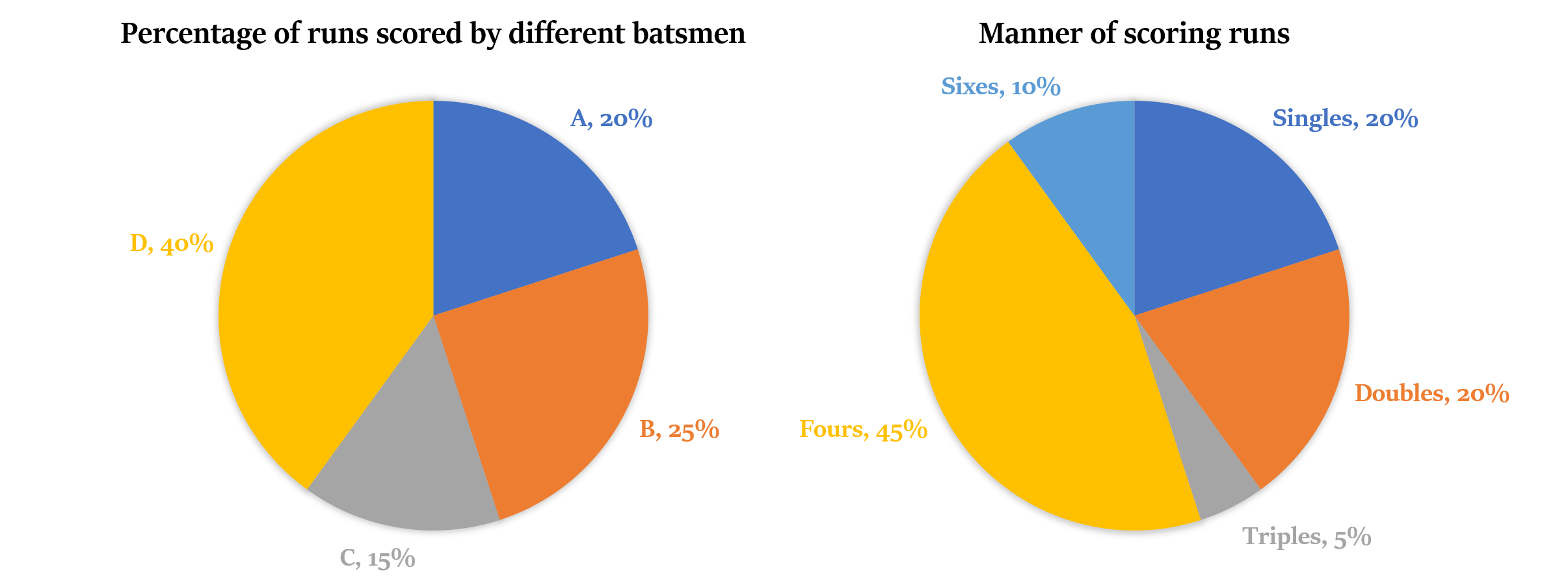
There were no extra runs scored in the match, i.e. all runs came out of the bat.
What is the minimum possible score of the innings?
(a) 60
(b) 120
(c) 240
(d) 360
Explanation
Let the number of singles, doubles, triples, fours and sixes scored in the innings be i, d, t, f and s respectively.
As minimum runs are scored through triples, we will take it as our reference.
Runs scored through triples = 3t = 5% of total
Runs scored through singles = i = 20% of total = 4 × 3t = 12t
Similarly, runs scored by doubles = 2d = 20% of total = 4 × 3t = 12t,
or d = 6t
Runs scored by sixes = 6s = 10% of total = 2 × 3t = 6t,
or s = t
Runs scored by fours = 4f = 45% of total = 9 × 3t = 27t,
or f = 27t/4.
As the number of fours must be a natural number, t must be a multiple of 4. Hence, the minimum value of t is 4.
So, the minimum possible score = i + 2d + 3t + 4f + 6s = 12t + 12t + 3t + 6t + 27t = 60t = 60 × 4 = 240 runs.
Answer: (c)
Choose the incorrect statement from the following:
(a) Number of sixes hit were equal to the number of triples taken.
(b) Number of doubles taken were half of the number of singles taken.
(c) Number of doubles taken were six times the number of sixes.
(d) None of the above
Explanation
As seen earlier, number of singles, doubles and sixes are i = 12t, d = 6t and s = t respectively. Hence, the first three statements are correct.
Answer: (d)
If D did not scored any four, then what is the minimum possible manners (i.e. singles, doubles, triples, fours) of scoring runs that he must had used to score his share of runs?
(a) 1
(b) 2
(c) 3
(d) 4
Explanation
D scored 40% of the total runs, without scoring any four. So, he may score the required runs utilizing the minimum possible manners of run making, if he scores all the singles and doubles, i.e. 20% + 20%. Any other alternative will lead him to use 3 or 4 different manners of run making.
Answer: (b)
What is the minimum number of batsmen who have hit a four?
(a) 1
(b) 2
(c) 3
(d) 4
Explanation
45% of the runs have been scored through fours. Hence, to minimize the number of batsmen who have hit a four, we assume that D scored all his runs through fours, i.e. 40% of the runs. But 5% of the runs are still left to be accounted for. Hence, at least one more batsmen will hit some fours.
Answer: (b)