Line Chart Questions
In this article, we are going to have a look at the various kinds of Line chart DI sets.
Type 1: Line Chart Comprehension
This is one of the most beautiful type of line chart sets. You need not do much calculation (sometimes no calculation at all!). All you have to do is think, understand what the graph is telling you, comprehend it.
Let’s see a few examples.
Q. A bacterium divides every minute into two. If the death rate is negligible, then which of the following curves namely A, B, C and D, will represent the population growth of the bacteria?
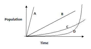
(a) A (b) B (c) C (d) D
Explanation:
The population of the given bacteria type, at any given point of time, can be represented as 2x, where x is a whole number. It’s an exponential function which is aptly represented by the curve D.
Answer: (d)
Q. A Tiger stalks his prey, moves slowly, stopping occasionally and finally making a dash towards the prey. If the distance travelled by the Tiger during this pursuit is represented along the Y axis, then which of the following graphs best represents the movements of the tiger while catching his prey?
(a) 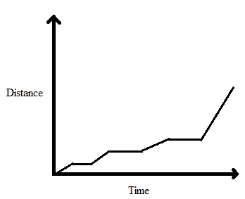
(b) 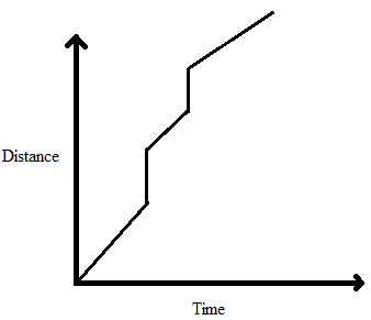
(c) 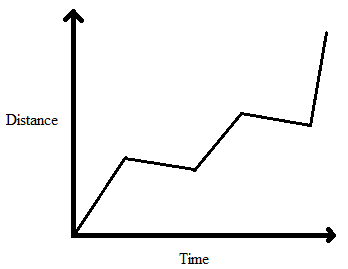
(d) 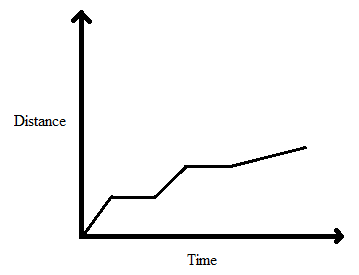
Explanation:
Answer: (a)
Option (b) can be rejected straightaway, as it shows that the Tiger travels some distance in zero time duration (represented by the vertical lines). It means that the Tiger has infinite speed, which is not possible.
Option (c) is also wrong as it shows a decrease in distance with time which is not possible. According to the question, the tiger stops occasionally during his pursuit of the prey. The only two graphs representing this are given in option (a) and option (d).
Out of option (a) and option (d), option (a) is correct as it shows a rapid increase in speed of the Tiger at the end (according to the question, the Tiger makes a dash towards the prey in the end). Whereas in option (d), the tiger moves slower in the end than his earlier speeds.
Q. Consider the information given below and answer the 3 (three) items that follow.
Following graph depicts a 20 km race between a Rabbit and a Tortoise.
Q1. How many times did the rabbit take rest during the race?
(a) 2
(b) 3
(c) 4
(d) 6
Q2. After starting the race from the same point, how many times did the Rabbit overtake the Tortoise during the race?
(a) 2
(b) 3
(c) 4
(d) 5
Q3. After how much time since the start of the race did the Tortoise overtake the Rabbit for the first time?
(a) 21 hours
(b) 29 hours
(c) 35 hours
(d) 14 hours
Explanation:
Answer 1: (b)
The horizontal lines in the graph depict the time-duration during which the Rabbit was at rest, as distance is not increasing with time. Thus, it’s evident that he took rest 3 times.
Answer 2: (a)
The Rabbit overtook Tortoise two times as shown in the graph given below.
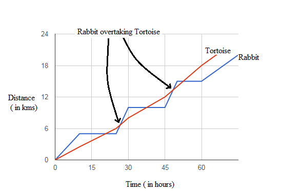 These are the instances on which the line graph of Rabbit moves above that of the Tortoise, i.e. when the total distance travelled by the Rabbit becomes more than that travelled by the Tortoise.
Answer 3: (a)
The Tortoise overtook the Rabbit for the first time at point A as shown in the graph given below.
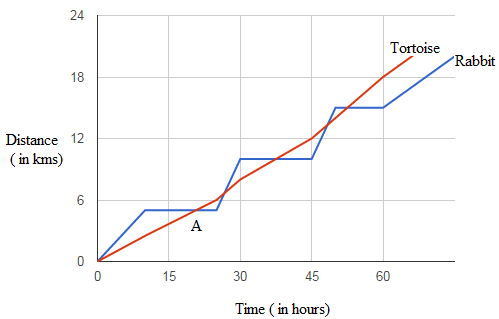 This happens at approximately 21 hours since the start of the race. Hence, option (a) is the correct answer.
In fact we may straightaway eliminate options (c) and (d), as they fall outside the 15-30 hours range, while point A is definitely within this range.
Q. Observe the following graph carefully, and answer the 2 (two) items that follow:
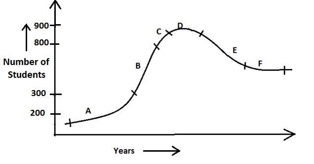 The line graph shown above depicts the number of students in a university across various years.
Q1. Which region of the curve corresponds to the region of maximum growth in the number of students in the university?
(a) B (b) C (c) D (d) E
Q2. Which region of the curve may be representing the initiation of a decline in the popularity of the university, based on the parameter of the number of students enrolled in the university?
(a) C (b) E (c) F (d) D
Explanation:
Answer 1: (a)
Observing the figure we can easily conclude that A, B and C zones are definitely among the zones of high growth rate (of the number of students in the University).
Zone A may be rejected as here the growth rate has just started picking up.
More specifically, the growth rate in zone A = [(300 - 200)/200] × 100 = 50% (approximately)
While, zone C may be rejected as here the growth rate has started falling down.
The growth rate in zone C = [(900 - 800)/800] × 100 = 12.5% (approximately)
However, the growth rate in zone B = [(800 - 300)/300] × 100 = 166.67% (approximately)
Therefore, B zone is the region of maximum growth rate in the number of students, in the given graph.
Answer 2: (d)
The curve started declining in the D zone, which reflects the fact that the number of students in the university started falling during this time.
Q. 77. In a match of 6 overs, a team took a single out of every ball, except a boundary every alternate over. If the total average is calculated after the end of each over and the first boundary was hit in the second over, then which of the following graphs represents the match appropriately? It is given that each over has 6 balls and boundary means 4 runs. A boundary and single cannot be hit on the same ball. X-axis denotes average runs after every over.
(a) 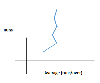
(b) 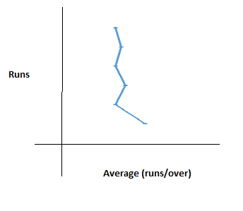
(c) 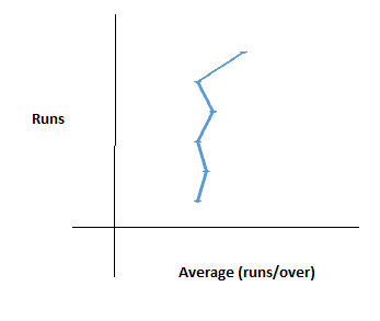
(d) 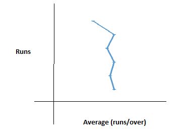
Explanation:
The score in the first over = 6, i.e. 6 singles. Hence, average = 6 runs/over.
The score in the second over = 9, i.e. 5 singles and a four. Hence, average = (6 + 9)/2 = 7.5 runs/over.
Average after third over = (6 + 9 + 6)/3 = 7 runs/over.
Average after fourth over = (6 + 9 + 6 + 9)/4 = 7.5 runs/over.
Average after fifth over = (6 + 9 + 6 + 9 + 6)/5 = 7.2 runs/over.
Average after sixth over = (6 + 9 + 6 + 9 + 6 + 9)/6 = 7.5 runs/over, and so on.
Hence, after every even number of overs the average will become 7.5 runs/over. Also, as the overs will keep on increasing, the average after odd overs will keep getting closer to 7.5 runs/over.
Hence, as the number of overs/runs will increase, the zigzag line will tend to become more linear.
Answer: (a)
Q. The figures given above show two trains positioned at the same place at t = 0 and travelling in the same direction on parallel tracks thereon.
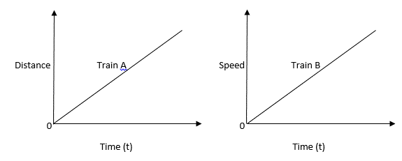 Which statement given below is correct?
(a) Both will travel the same distance in the same time.
(b) Train B will always be ahead of train A.
(c) Train B will lag behind train A initially, but will overtake it after some time eventually.
(d) After a particular time period train B will definitely have a larger speed than train A.
Explanation:
It’s evident that the train A has a constant speed, while train B has a constant acceleration. Thus, the speed of train B will keep on increasing with time.
As we cannot be sure about the relative speeds of trains A and B at any given point or period of time, we cannot arrive at any of the conclusions drawn in the first three statements.
Though as the speed of train B is constantly increasing, we can say for sure that after some time it will have a larger speed than train A, even if it was moving slower than train A in the beginning.
Answer: (d)
Q. The graph represents the population of a country in millions and the food production of that country in million tons from year 2000 to 2003. Consider the graph and answer the item that follows.
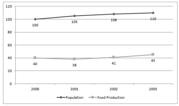 What is the trend of per capita food production in the country during the years 2000-2003?
(a) Increasing
(b) Decreasing
(c) Fluctuating
(d) Cannot be determined
Explanation:
Per Capita Food Production in any specific year = Total food production in that year/Total Population present in the year
Now we can analyse after studying the graph that the population of the country is continuously increasing whereas the trend of food production is fluctuating, as it had decreased in 2001 and then increased in the subsequent years.
So, overall the graph represents a fluctuating trend as far as per capita food production in the country is concerned.
Answer: (c)
Q. The graph represents the prices of unprocessed logs of wood per cubic meter, processed logs per cubic meter and carved wood per ton from year 1983 to 1986. Consider the graph and answer the item that follows.
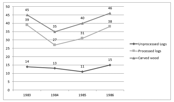 In an industry, carved wood is produced. The industry can either purchase unprocessed logs or processed logs. In which year in the given period will it be profitable for the industry to purchase processed logs rather than unprocessed logs?
(a) 1984 (b) 1985 (c) 1986 (d) Cannot be determined
Explanation:
The question does not provide any information regarding the comparative cost benefits of processed logs and unprocessed logs, i.e. we don’t know the cost involved in converting unprocessed logs into processed ones. So, it cannot be determined in which year will it be most profitable to buy processed logs rather than unprocessed logs.
Answer: (d)
Type 2: Line Chart Calculation
Now let’s see some DI sets involving line charts where we need to do some calculation, e.g. based on percentage, average, ratio, etc.
Q. A train was travelling at a speed of 25 m/s. On seeing red light, the driver applied the brakes and the train came to a halt after travelling for some distance in 10 seconds. The speed time graph for the period after applying the brakes, is given below.
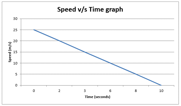 What is the distance travelled by the train after the driver applied the brakes?
(a) 250 m (b) 125 m (c) 300 m (d) 100 m
Explanation:
The distance travelled is given by the area under the curve of speed v/s time graph.
In this case, the area under the triangle with base 10 seconds and height 25 m/s is the required distance.
Area = ½ × 10 × 25 = 125 m.
Answer: (b)