Basic Approach to Line Chart
What is a Line chart?
They often represent the trend or a pattern by connecting the data points plotted.
The line and bar charts use the concept of X and Y axes, i.e. here the data is represented in two dimensions. The X-axis is the horizontal bar and the Y axis the vertical bar, each representing a certain variable, e.g. years, number of runs, etc.
For example, have a look at the line chart represented below:
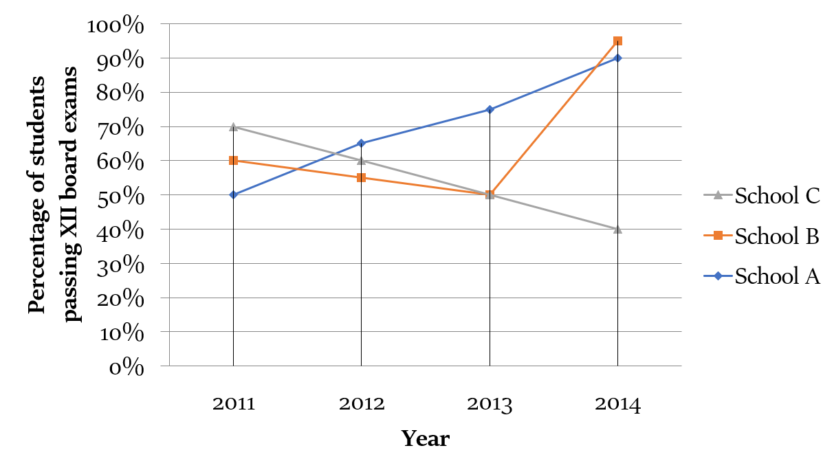
It showcases the year on the X-axis and the percentage of students that passed from a particular school on the Y-axis.
Now, let us try to extract information out of the data and solve a few questions based on the line-chart given above.
Question 1
Students of class XII of which school showed the maximum improvement in terms of pass percentage in the time span of 2011-2014?
Explanation
It can be easily deciphered from the data that the percentage of students that are passing from that school A is increasing every year.
The pass percentage decreased for the first three years for school B, however it increased drastically in the year 2014.
While, the pass percentage is decreasing every year for school C.
Hence, it will be futile to even consider school C, as just a visible scrutiny of the chart makes it amply clear that the percentage of passing students is decreasing every year, rather than improving.
It’s significant to draw such inferences first hand to avoid unnecessary calculations. In fact DI is as much about reducing the calculations involved as it’s about number crunching.
However, if the question had asked the maximum ‘change’ rather than about the maximum ‘improvement’, then we should have had to consider school C too. While ‘Change’ can be either in positive or ‘negative’ direction, ‘Improvement’ means positive change only. Hence, a student should remain vigilant while comprehending the exact demands of a question.
Now, considering schools A and B:
Improvement of students of school A = [(90 - 50)/50] × 100 = (40/50) × 100 = 80%
Improvement of students of school B = [(95 - 60)/60] × 100 = (35/60) × 100 = 58.33%
Hence, the answer is school A.
We may further enhance our speed by avoiding even the calculation done above. Using the concept of ratios, we may easily see that 40/50 is a bigger number as compared to 35/60. Notice that in the fraction 40/50, the numerator is 0.8 times the denominator. Hence, if the denominator is increased to 60 by adding 10, then in order to keep the value of the fraction constant, we must add 0.8 × 10 = 8 in the numerator. So, the new fraction should be 48/60. As 35/60 has a lower value, it is deemed to be smaller than 48/60, i.e. 40/50.
Question 2
Considering all the three schools A, B and C, in which year was the number of students passing their XII board exams the maximum?
Explanation
The art of DI also involves recognizing trap questions, which may be of either of the two types, i.e. either time consuming or conceptually probing.
The above question is of the second kind. It demands a student to have concept clarity with respect to percentages. We know that percentages can only be with respect to a base number/value, e.g. 20% of 150.
However, as we have no idea of the number of students studying in the three schools in the years mentioned, we may not be able to determine the year in which maximum number of students qualified XII board exams.
Line charts for drawing correlations
Line charts also showcase the relationship of the variables represented on the X and the Y axis. Hence, they may be utilized for drawing correlations. For example, in the above line chart, it may be concluded that the school A’s performance is improving with time.
However, most of the times only correlations may be drawn as there might be other factors at play, e.g. in the above case it may be the result of the government’s policy of ensuring higher passing rates in the schools or lenient marking by the examiner etc.